Data Visualization Society State Of The Industry Survey Challenge 2022
(I suggest clicking on the image to view it in greater detail.)
In some depth…
Until recently, I had not been an active member of the Data Visualization Society (DVS); I passively consumed the great reads and inspiring data visualisations that their weekly emails are brimmed with, and attended a couple of online workshops, and virtual coffee breaks. I finally jettisoned my label of DVS lurker in May 2023, when I last-minute decided to take part in their State of the Industry Survey Challenge 2022. For context, an annual survey gets sent out to DVS members in order to better understand where this fairly young industry of Data Visualisation is headed. Then comes a challenge that encourages members of the community to visualise (surprise, surprise) the survey’s results.
Most participants of the challenge make some great data visualisations of the demographics of data visualisation practitioners, sketching a picture of everyone’s backgrounds and experiences, and the types of tools that are most popular to use. The survey committee published an already pretty comprehensive report of their survey findings, and then invited members to further explore the data. Appreciating that most entrants would already have taken the low- to mid-hanging fruit of analysing which gender/age range/salary grade/educational background prefers what tools/chart types, etc. I deliberated over what I might be able to still fish out from the data that has not already been done by someone else.
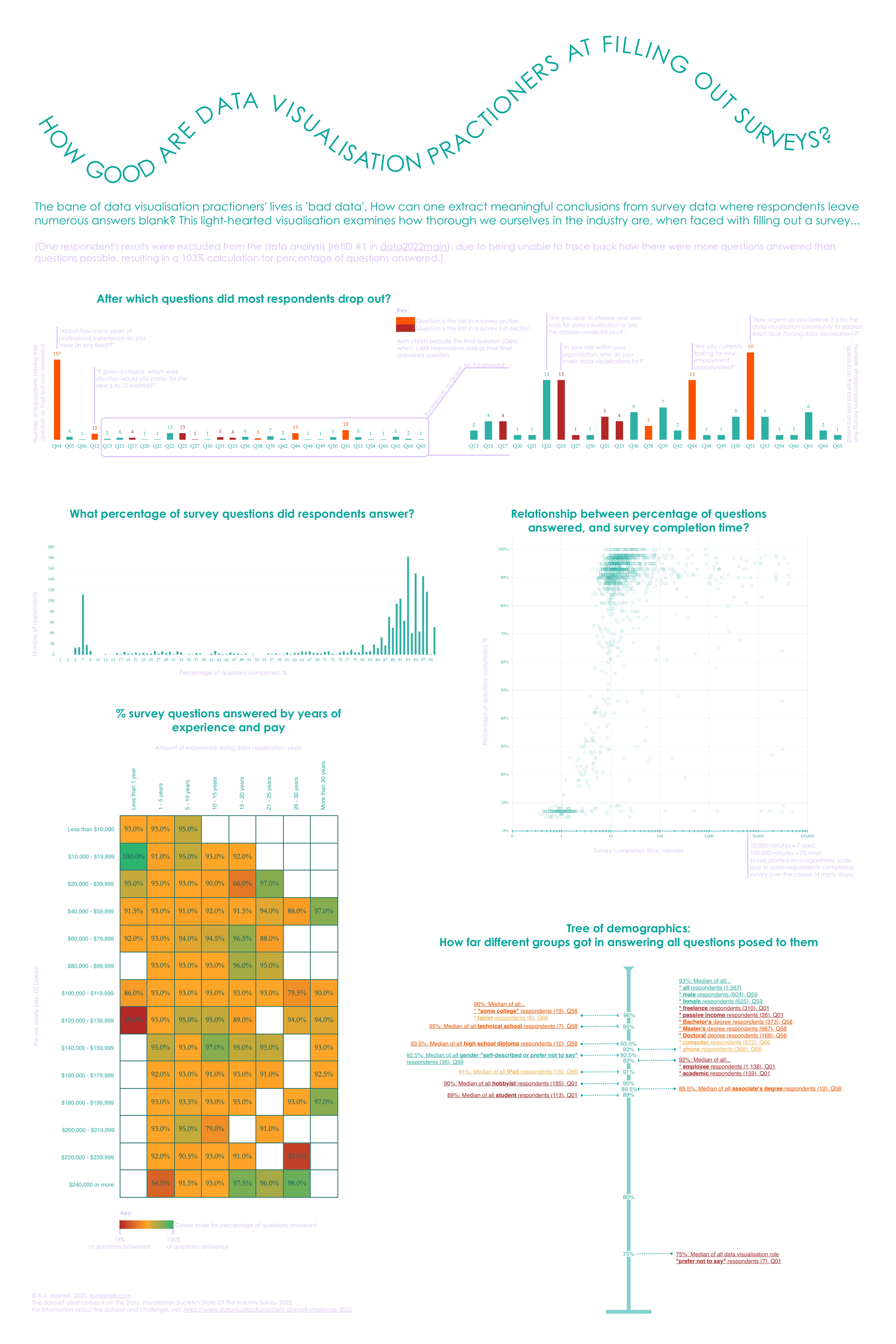
This decision led me to making possibly DVS’s least insightful data visualisation entry, but hopefully a vaguely amusing one. As a practitioner of data visualisation, one of the most frustrating moments in the data visualisation pipeline comes after having a) decided upon a topic to visualise, and b) found a couple of datasets about the topic at hand. This is the moment when one opens said datasets, only to find them incomplete or lacking. Survey datasets are particularly susceptible to providing great dismay, as their success relies upon human respondents obediently filling out each and every question posed to them, in a similar format to every other respondent. This, strangely enough, does not tend to happen in the real world. And answers to qualitative questions are possibly the most painful type to sift through. My hypothesis was that data visualisation practitioners all lament a bad survey dataset, and therefore ought to take more care than the regular citizen in answering a survey thoroughly, especially given it is about their own professional field. Though there was no way of objectively testing this hypothesis, I did have it in my power to find out which members of the field are the most virtuous when it comes to survey completion.
The first job was to load the csv file into Excel, and begin making basic calculations regarding the level of survey completion, a.k.a. the percentage of questions a respondent answered. My job was made relatively easy because the publishers of the dataset shared how many questions each respondent was presented with, as there were different question tracks that the survey could take a respondent on, dependent on their occupation. I then began looking at various demographic groups, and seeing which groups were better than others with regard to the percentage of questions answered. In the end, the data was simple enough to perform all analysis and chart creation within Excel, and I exported those charts to Pixelmator Pro to finish up the visualisation in a poster format.
The end visualisation is undoubtedly far more simplistic than the likes of 2021’s winning entries, but I had fun creating it, and using this as an opportunity to get back into data visualisation after a half-year hiatus. I also had “enter a data visualisation challenge” on my 2023 bucket-list, so I can happily cross off this goal, and will now find entering any future competitions less daunting, knowing that there really isn’t any real consequence for not producing the slickest work.
Reflections
There are a couple of weaknesses in my visualisation design:
1. For aesthetic’s sake, I chose some pretty hard-to-read colours for the small lilac font meant for descriptions. I did not want the descriptions to take up too much attention, but they really do not have enough contrast with the white background. No matter how vogue it is at the moment to create pastel UX with small typeface, the readability of a visualisation should not be too compromised.
2. There is a little too much white space around the large block of colour in the bottom left-hand corner that throws the visualisation a tad out of balance. I had plans to still include a world map showing how respondents from different countries fared, but with limited time I scrapped the idea in order to submit the visualisation.
3. Some more visual interest in the background, or at least around the header, would have given the poster some more je ne sais quoi.