Visualisation of ESG Progress in Fast Fashion

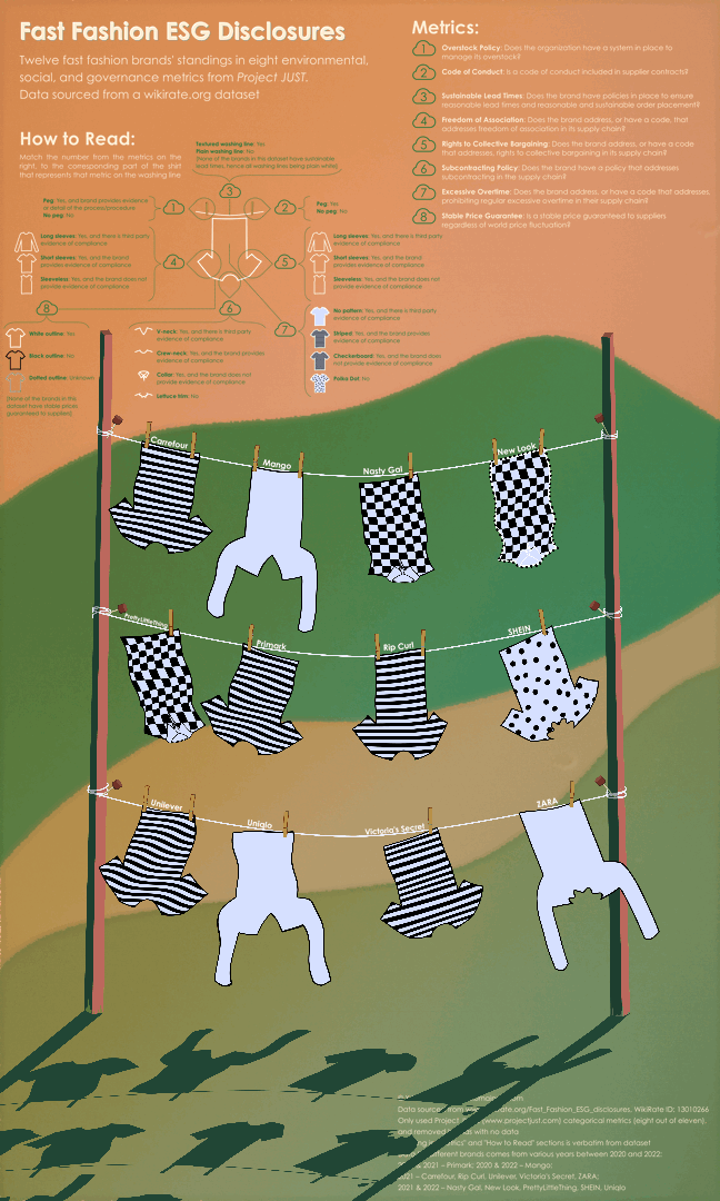
To bring awareness to the Clean Clothes Campaign (CCC), I wanted to make a playful data visualisation that is accessible to anyone who might not necessarily be data literate. I did not want a chart-heavy visualisation to drive away individuals who might otherwise have wanted to learn about the data’s the subject matter, and thus encoded the data within an animation of clothes drying in the wind on a clothes line (see bottom of post for animation). The animation’s movement draws in the eye (though it could result in some dizzyness after prolonged viewing…), and the detailed key allows the viewer to explore different aspects of Environmental, Social, and Governance (ESG) progress by various fashion brands, at their own pace.
As explained by the key in the visualisation, each shirt hanging up to dry represents a different brand, and the different design elements of each shirt, as well as the presence of clothing pegs, describes their status with regard to a particular ESG metric. I chose to focus on a subset of data within the original dataset (found on wikirate.org), namely Project JUST‘s metrics, and used their eight categorical variables. I had initially wanted to group the E’s, S’s, and G’s in a logical manner within the shirts, but this idea was quickly derailed. Two of the eight variables were ‘Environmental’ (Overstock Policy and Sustainable Lead Times), and I thought that having these each represented by a peg would be perfect. That was until I discovered that not a single one of the twelve brands for which there was data, had proven sustainable lead times. This would mean that all shirts would lose a peg on at least one side, and not have a peg at all if they also did not possess an overstock policy. To avoid having to deal with the physics of floating laundry, I opted to make one of the pegs represent “Code of Conduct,” and relegated sustainable lead times to the texture of the washing line (note how all washing lines have the same texture, because all brands lack sustainable lead times).
The most practical (and time-consuming) issue that I faced while making this visualisation, was creating a GIF with a high resolution. I had made the initial poster 6,000 * 10,000 pixels large (excessive, I know, but I like a big canvas), and thus never had an issue with reading the key upon zooming in. GIFs, I discovered, are not a very friendly file format for efficient compression, nor are there many applications that allow for the creation of high-resolution GIFs in the first instance. I opted for compressing the individual PNG frames that made up the GIF, and then stringing them together within the Preview app on Mac, a tedious process that involved numerous crashes and “Application Not Responding” messages (0/10, cannot recommend). Then came the hurdle where wordpress.org does not allow media uploads greater than 2MB, and I found multiple online GIF hosting services also possess the same attitude. The eventual compromise was to here share a low quality version of the animation, alongside a higher quality (but still compressed) single frame for easier reading of the key.